Evaluation:
My brief was to create a front cover, double page spread and the contents page of a music magazine - with a minimum of four original images. This involved much research and planning, plus the use of photo manipulation and a desktop publisher.
The research stage was straight forward; I looked at other music magazines and analysed them. I had to see what their audience was, their ideology, what institution made them and how the represented artists so that when it came to my magazine, I could incorporate conventions of those magazines in my magazine.
For example, I found that most magazines had a masthead, main image, headline, promotions, date and issue number and a barcode. So, in my magazine, I made sure I had all of these elements. For my promotion, I offered the reader a free ‘Music Poster inside’ along the top of my magazine, so when racked along other magazines, this promotion and the masthead would be visible and eye-catching.
I also realised from my research that if a single artist was present on the front cover, they would usually appear powerful, dominant and very important. This is what I tried to achieve with my image. My model is standing with a hand on her hip, looking (or what seems) directly at us and she slightly covers the masthead giving her importance.
The masthead had to be simple and noticeable. I realised that my magazine would contain a dominance of dance, pop, R&B because that is what mostly dominates the charts and I had to create a font that would represent these genres. I chose a font called Base 02, which at first looked incredibly R&B, but also very cool – which is the ideology of my magazine, making chart music appear cool.
In the double page spread, I found that most magazines always had the first letter of the article large and bold (Drop cap). It is used to help the reader find the beginning of the article or to draw their attention to the beginning of the article and therefore I created the first letter of my article large and bold to follow the convention.
In the other magazines that I researched, the double page spread had a large image on one side, and the article on the other. In two of the magazines, the headline was very big and dominated the top of the page. Although the magazines had both article and picture separated on each page, this could have been coincidence. However, because it seemed popular, I decided to do my double page spread the same way.
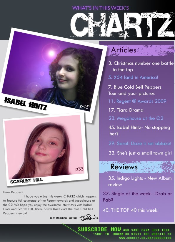
When I analysed the many different contents pages I discovered that instead of having all of the articles just listed on the page, they were split up into different sections like ‘news’, ‘articles’ and ‘events’. So, to fit with the convention, I also split my articles into the sections of ‘Articles’ and ‘Reviews’. This also makes it easier for the reader too – so it seemed even more important that I separated my contents.
Also, from the contents pages I analysed, I found that every contents page had pictures of artists that are featured somewhere in the magazine and they usually had a number next to them to tell us where in the magazine they are. This could be so that when you open the contents and see and artist you like, you can go straight to that article, news or review. Therefore, because of this, it seemed appropriate to incorporate this in my magazine contents page.
The biggest problem I faced during the making of my magazine was which audience I would appeal to. So, to solve the problem, I picked a wide audience; those who are interested in the top 40 charts. More downloads and sales, the higher you are in the charts. So, in theory, the most popular music artists are in the charts and therefore the most popular artists would be in my magazine. Also, usually the top 40 includes many different genres and the latest, more up-to-date music. I decided to call it CHARTZ so that anyone reading the masthead will know what it is about and the Z gives it a modern, more ‘cool’ feeling.
Next, I had to attract my audience. To achieve this, I included the top 40 charts in my magazine, along with the top contenders ‘Who will be Christmas number one?’ to emphasise the magazines interest in the charts.
Then, on the front cover, I listed many different artists (at the bottom) all of which sound that they are from different genres of music. I asked a few people what genre the name ‘Megahouse’ would most likely fit into. Three replied dance and another replied electro. I asked the same people what the name ‘Blue Cold Bell Peppers’ made them think of and they all thought of rock after the band ‘Red hot chilli peppers’. This meant that I had successfully incorporated a variety of genres in the magazine.
My age audience was teenagers. They are most likely to listen to music and therefore more likely to buy music magazines. To address the teenage audience, I kept the magazine cheap and had a young artist on the cover.
The institution that would be most likely to distribute my magazine would either be an institution that produces and distributes music magazines already such as Bauer Media Group that publishes Q and Kerrang!. These will already have the means to distribute and print the magazines so it would be easier for a company that already produces magazines to publish my magazine. Or, www.theofficialcharts.com who are in charge of the official charts and who collect the data.
I changed a small amount during the drafting process. The front cover had a promotion of ‘free Christmas poster’ to ‘free music poster’ because I thought that a Christmas poster wouldn’t be very attractive in a music magazine. So I changed it too a music poster, which is more fitting. The lists of other artists didn’t fit in the making of the front cover, so they were relocated to the bottom of the page to make the bottom look less plain and to also make the left side less crowded.
Hardly anything in the contents page drafting changed except that CHARTZ was moved to the right because it looked different and more modern.
Once I had my magazine completed, I still had to make some changes. The contents page appeared too feminine because of all the light purple and baby blue. I also had some text I pink and this was changed to purple so it didn’t appear too feminine. I decided to change the background block of colour of each heading like ‘Articles’ to an effect called ‘Destroy’ which looks like the block is eroded. This made the blocks also match the CHARTZ logo. Then I added a ‘Subscribe now’ at the bottom of the page in a green, square, pixelated font, to add another colour so it didn’t look all purple and light blue. Plus, the bottom lacked text and it looked a little plain, so that was another reason for the addition of the ‘Subscribe now’.
Luckily for me, at the beginning of the preliminary task, I already knew how to use PhotoShop and DTP. However, I’d never used PhotoShop CS3 before so during my preliminary task I had the chance to practice and develop my skills in PhotoShop for my main task which were much needed; every single page in my magazine required PhotoShop.
Progressing from my preliminary task, I’d learnt that I needed to be more careful with my colour. On my college magazine front cover, there had been a lot of pink and orange, and then there was also green, black, white and blue and it didn’t work – there were too many colours. So, in my music magazine I stuck to two or three main colours so that it looked more professional and so that it did not over-complicate the cover. Plus, music magazines, and even fashion magazines do the same thing; they stick to a tight colour scheme.
Once my magazine was completed, I decided to ask people what they thought of my magazine. I created two polls on my blog so that they could vote and see my work. The first poll question was ‘How much would you spend on my WEEKLY magazine?’ and all of the results came back as £1.01-£2, which is good, as I picked the cost to be £1.90 originally. The second question was ‘What age group do you think are likely to read my magazine?’ and all of the results came back as age 13-19 years, so that means that my attempt at attracting my audience was successful.
I was pleased that my target audience was what my ‘poll voters’ chose. Overall, personally, I really like my magazine and it is better than I could have hoped for. I wish that I could have had more male artists in the magazine, because I feel that the magazine is singling them out because of the lack of male images. That would be the only thing that I wish I could have changed.
Friday 26 March 2010
Wednesday 17 March 2010


Friday 12 March 2010
IT Draft and hand drawn drafts of the Double Page Spread


Hand drawn drafts. The first drafts before colour was decided.
 This is the final draft of the contents page. This includes the colour, which I have chosen to be pink. I think young girl's are thought to be 'fans' of the the colour pink and hence my choice of the colour.
 The choice of picture on one side and text on the other coms from observations of other magazines. The ones I analysed had similar layouts to what I have drafted.
Thursday 11 March 2010
Moodboard

Moodboard for the front cover. The idea of a storm to describe the front cover artists sudden rise to fame. I thought was quite creative. The electric guitar symbolising rock and the holly to symbolise Christmas!
IT Draft, and hand drawn drafts of the Contents Page

Here are the drafts of the contents page. The hand drawn drafts are colourless but have the general shape. The IT draft has the chosen colours and chosen draft.


Subscribe to:
Posts (Atom)